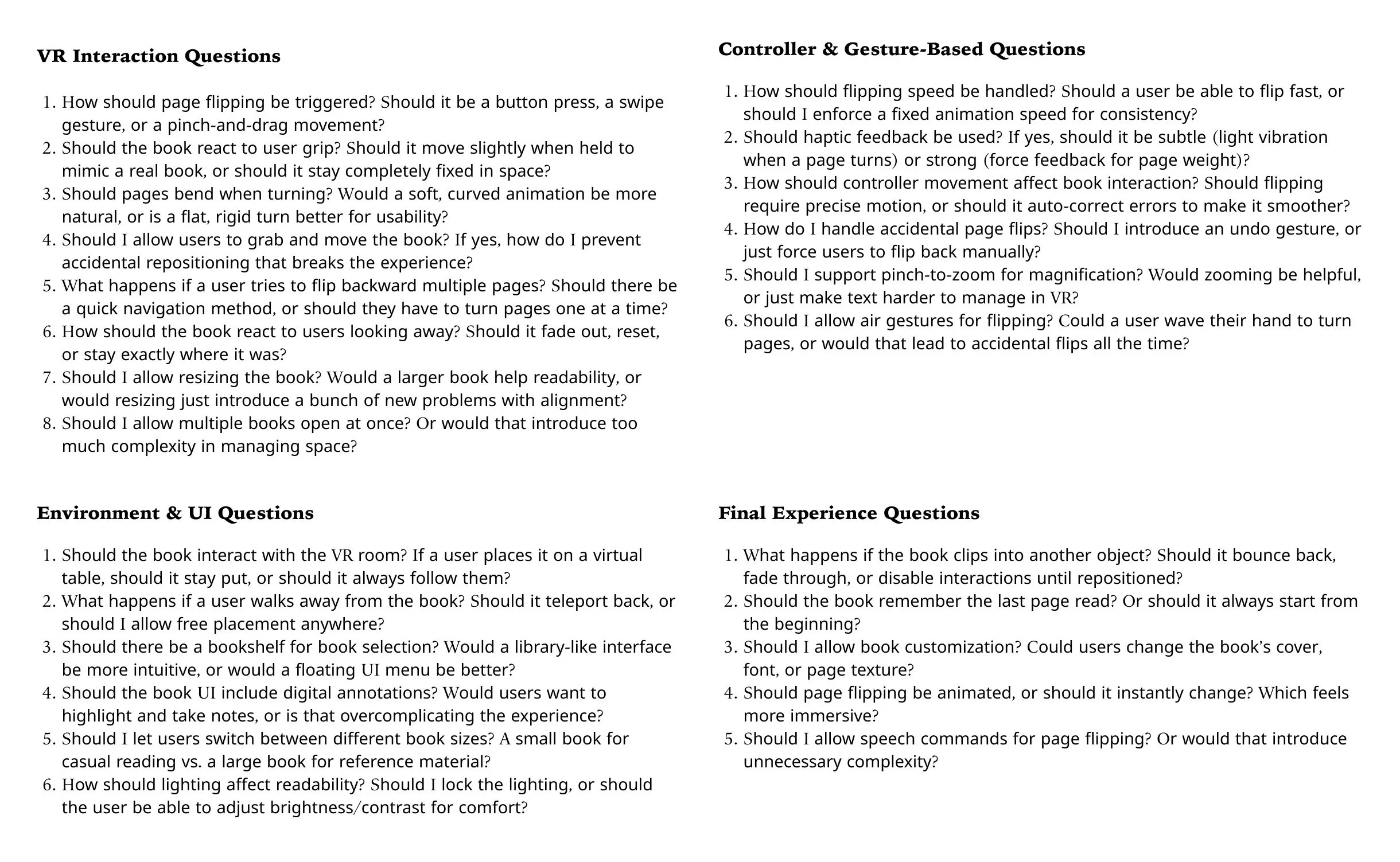
Week 1 (Jan 6 - Jan 12) | Research Hell Begins
The first week of any project should be about laying the groundwork; understanding the problem, identifying constraints, and setting up a timeline. That’s what I told myself. What I didn’t tell myself was that research would immediately become a black hole of technical papers and conflicting information that I would be drowning in for the next few weeks.
What Should Have Happened:
Find existing research on hand tracking, haptics, and mixed reality.
Define clear goals for the project.
Start sketching possible interaction models for how this book would work in VR.
What ACTUALLY happened:
Found way too many research papers that all said different things.
Got lost in UX theories on mixed reality that made everything seem both obvious and impossible at the same time.
Started questioning why I thought this was a good idea in the first place.
Summary of Papers Read
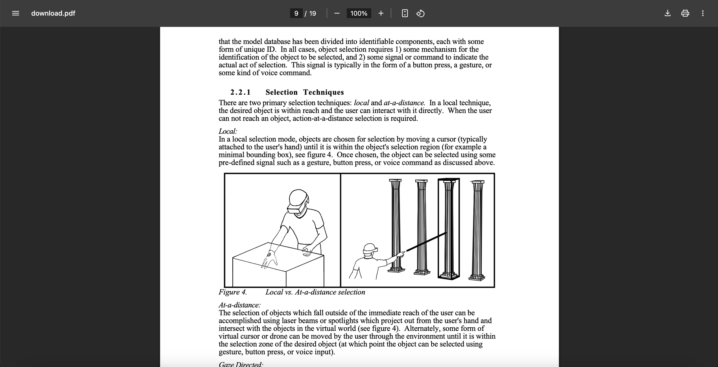
A Survey of Augmented Reality - Had to wade through tons of AR research to understand how the physical-to-virtual transition should work

I have made a mistake.
Week 2 (Jan 13 - Jan 19) | The Scope Spiral
At this point, I thought I had a rough idea of what I wanted to build. The project was supposed to be about VR books—simple enough, right? Wrong.
What Should Have Happened:
Finalize a list of core interactions that needed to be implemented.
Start figuring out what tech limitations I would have to work around.
What ACTUALLY happened:
The more I researched, the bigger the project scope became.
Kept adding and removing features because every interaction seemed to have some massive drawback.
Started realizing that VR books are a UX nightmare—they either feel too much like a real book (which makes the tech feel unnecessary) or too much like an e-book (which ruins the whole point of the project).
Summary of Papers Read
User Centered System Design - Had to dig into how people interact with digital interfaces to stop myself from overcomplicating everything.
A Taxonomy of Mixed Reality Visual Displays - A reminder that mixed reality isn’t just one thing but a spectrum of interactions, and that I needed to pick a lane.
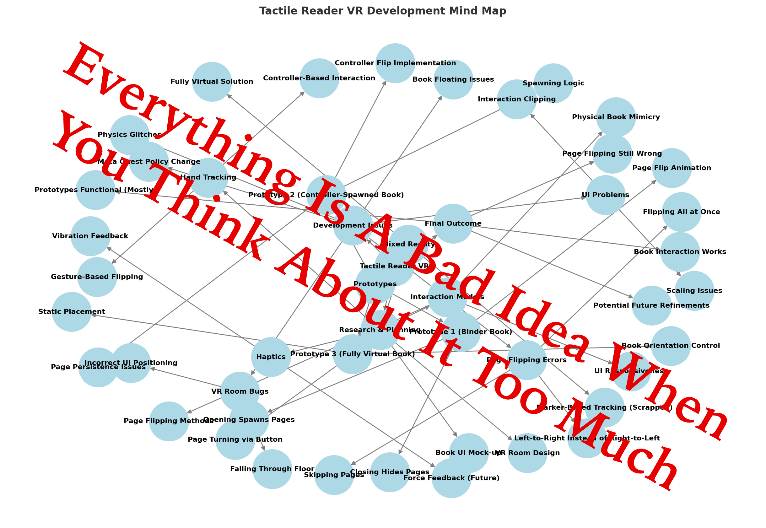
Mind Map
Week 3 (Jan 20 - Jan 26) | Research Continues, Sanity Deteriorates
At this point, I had too much theoretical knowledge and no real direction. Research was useful, sure, but at some point, things needed to start moving.
What Should Have Happened:
Identify a baseline VR reading experience that would make sense for the project.
Determine what kind of feedback mechanisms would improve interaction.
Lock down a framework for implementation before moving forward.
What ACTUALLY happened:
Realized no one agrees on what a “good” VR interaction model looks like.
Got stuck reading about marker-based tracking before realizing it probably wasn’t even necessary.
Became paralyzed by choices—so many ways to implement this, yet none of them felt quite right.
Summary of Papers Read
Virtual Environment Interaction Techniques - A deep dive into how VR interactions should feel, which would have been helpful weeks ago.
I am learning everything and nothing at the same time
Week 4 (Jan 27 - Feb 2) | Pre-Development Planning & UI Mock-Up
This was the last full week before actual development started, so it was time to finalize interactions and sketch out the user experience.
What Should Have Happened:
Finalize the reading mechanics for the VR book.
Make a UI mock-up to ensure a smooth reading experience.
Start setting up the VR environment layout.
What ACTUALLY happened:
Finally started creating the book UI, which was somehow the easiest part so far.
Spent too much time arguing with myself over what should be interactable.
Still didn’t touch Unity, because I knew the moment I did, everything would break.
Summary of Papers Read
Concept Statement - This was when the core interaction design finally started making sense.
The first thing that actually makes sense in this project.
Week 5 (Feb 3 - Feb 9) | The Last Week Before the Suffering Begins
This was the final week before actual development started, which meant one last chance to figure out anything I hadn’t already overcomplicated before diving into Unity and letting everything fall apart in real time.
What Should Have Happened:
Lock down all remaining design decisions.
Ensure every interaction and feature planned was actually feasible.
Identify potential problem areas in implementation and figure out preemptive fixes.
What ACTUALLY happened:
Fell into a last-minute panic about page ordering and whether pages should dynamically generate or be preloaded.
Got unreasonably fixated on font rendering and UI readability, even though it wasn’t something I needed to think about yet.
Spent way too much time questioning interaction models, despite already having weeks of research on it.
Summary of Papers Read
User Centered System Design - Reread sections just to convince myself I wasn’t designing something completely unusable.
This is why people just build things without thinking too hard
Week 6 (Feb 10 - Feb 16) | The Meta Quest Setback Hits Like a Truck
Everything collapsed this week.
Meta Quest updated its privacy policies, and suddenly, the original plan was dead on arrival. It wasn’t a minor adjustment—it was a catastrophic, kill-the-whole-system change that meant everything I had planned up until now was useless.
What Happened:
The entire tracking system was now unusable due to privacy restrictions on camera-based tracking.
Every single research paper I had read on fiducial markers, SLAM tracking, and hybrid AR/VR recognition? Useless.
Had to redesign the prototypes from scratch to comply with these restrictions, meaning weeks of research and careful planning just got thrown in the trash.
Had to completely abandon any physical-to-virtual book tracking.
At first, I tried to find a loophole—a workaround that would let me use some kind of markerless tracking, but it became very clear, very fast that Meta had locked this down hard. I even asked Professor Rodriguez and Bryson from VESEL and we came up with a work-around to salvage the hybrid prototype. However, no more fancy real-world integrations. No more physical book page tracking.
At this point, I had two choices:
Throw my hands up and scream into the void.
Redesign everything immediately and somehow re-imagine three new prototypes in record time.
I obviously went with two, but that didn’t mean I wasn’t mentally screaming the entire time.
The New Prototypes (Thanks, Meta.)
After way too much panic, frustration, and cursing at my headset (Meta), I finally locked in the new prototype lineup:
Prototype 1 → A binder-like book that, when opened, spawns virtual pages inside VR. When closed, the pages disappear.
Prototype 2 → Uses the left controller to spawn a book in place of the controller when the primary button is pressed. The right controller flips pages.
Prototype 3 → A fully virtual book, where the user only uses the controller to flip pages.
That was it. No fancy real-world interactions, no fancy tracking. Just VR. I had no choice but to make the best of what was left.
Documentation
Marker Tracking and HMD Calibration for AR - Every single bit of research into fiducial marker tracking? Pointless. Had to scrap it entirely.
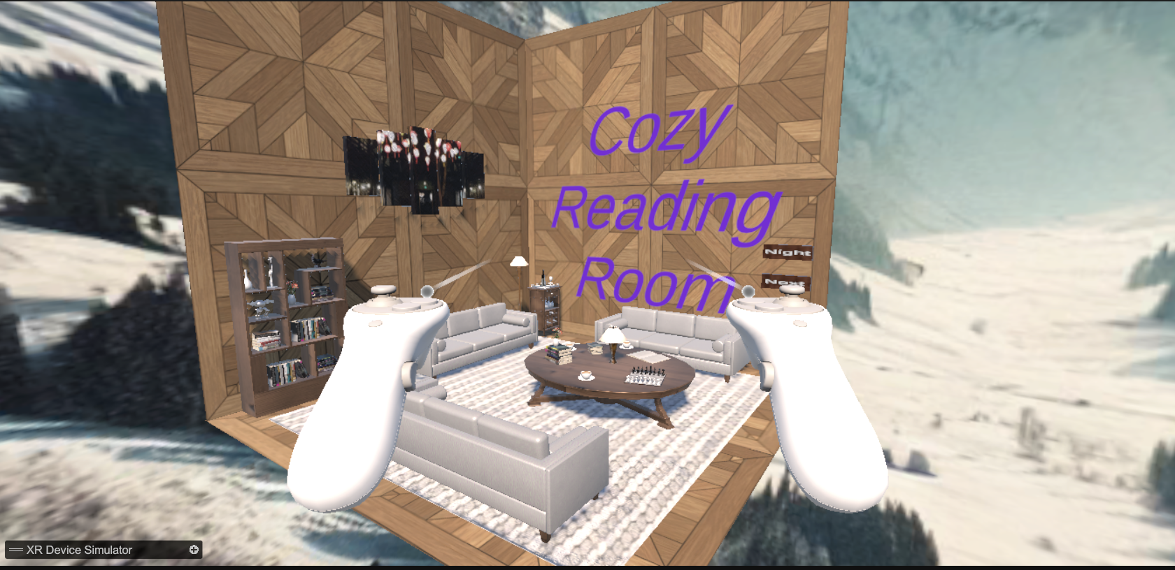
Week 7 (Feb 17 - Feb 23) | Building the VR Room (A Small Victory, Wee!)
I develop the VR room alongside the prototypes. Originally, it was supposed to come later, but at this point, I figured I might as well suffer all at once.
The VR room needed to:
Serve as a hub for testing all three prototypes.
Be interactable, allowing users to move around before engaging with the book.
Have a distraction-free reading environment, making sure nothing in the surroundings took away from the book interaction itself.
What Happened:
Designing a functional, interactable VR space where users could "walk" into the environment before spawning their book.
Creating a UI interface that allowed for navigation between different prototypes.
Implementing basic lighting, environment textures, and movement constraints to make sure everything felt somewhat immersive.
At the very least, by the end of the week, I had a functional VR room and a fully redefined project scope. It was a miracle I didn’t throw my headset into a wall.
Documentation
VR-Room Project Documentation - Had to brag, because this was the least stressful week of this project.
Virtual Environment Interaction Techniques - Used this to figure out how to make VR room interactions feel natural.
This is the one thing that didn’t completely break.
Week 8 (Feb 24 - Mar 2) | Prototype 1 Development (Fully Virtual Book)
This was the first week of actual development, and in classic Unity fashion, everything that could go wrong did go wrong. The goal for the week was to get Prototype 3—the fully virtual book up and running. No physical objects, no controllers spawning anything, just a straightforward, in-VR, page-flipping book. That should be simple, right?
What Should Have Happened:
Create a virtual book in the VR scene.
Implement basic page flipping so that pressing the correct button turns the page.
Ensure pages turn smoothly and in the correct direction (RIGHT to LEFT).
Make sure the UI works so users can interact with the book without issue.
What Actually Happened:
Page-Flipping Logic Decided to Ignore Reality: I had one job: make the pages flip like a normal book. Instead, they refused to behave like book pages at all. Sometimes, flipping a page did absolutely nothing. Other times, flipping one page triggered a domino effect, turning all pages at once into a rapid-fire flipbook. And the worst part? The pages flipped LEFT TO RIGHT instead of RIGHT TO LEFT. No matter how many times I adjusted the rotation logic, the pages insisted on moving in the wrong direction. I tried: Manually adjusting rotation values… No effect. Reversing input directions… Somehow made it worse. Forcing constraints… The pages still found a way to rebel. I even considered just hacking it by reversing the book orientation, but that felt like cheating. The book should just work like a book. Maybe it should be a Manga.
The Book Kept Rotating Out of Control: At some point, the book itself started rotating in random directions. Sometimes, it turned upside-down. Sometimes, it drifted slowly into the void like it was possessed. Occasionally, it would spin wildly the moment I tried to flip a page, as if rejecting the concept of reading itself. Turns out, I had accidentally applied physics constraints in a way that didn’t make sense, which resulted in unpredictable movements every time a page was turned.
UI Placement Was a Disaster: At first, the UI was positioned so low that I had to bend down in VR just to interact with it. After fixing that, it was too high, making it impossible to reach. No amount of scaling seemed to make it look “right.” Eventually, I gave up and manually positioned it by trial and error.
Final Status
By the end of the week, Prototype 3 technically worked, but it was still a mess. The pages finally flipped the right way, However, the book still drifted occasionally, and UI placement was only “fixed” in the sense that it was slightly less broken.

Is this what chaos feels like?
Week 9 (Mar 3 - Mar 9) | Built Prototype 2 (Controller-Spawned Book)
This week was all about the controller-spawned book. A quick button press would summon the book at your hand, and you could flip through it like magic. This interaction needed to feel seamless and magical—like conjuring a book out of thin air. Instead, I conjured nightmares. The book either didn’t spawn, spawned in the wrong place, spawned upside-down, or, if it was feeling extra spicy, spawned five copies at once.
What Should Have Happened:
Implement primary button spawning for the virtual book.
Align spawning location and rotation with the user’s left controller.
Enable smooth page flipping with the right controller.
What Actually Happened:
Pressing the spawn button sometimes did nothing... and sometimes spawned three books stacked together like cursed pancakes.
When it did spawn correctly, the book was often backwards or upside-down, forcing users to awkwardly twist around to find it.
Input lag turned spawning into a guessing game: "Press... wait... wait... surprise!"
Page flipping was technically right, but if the user moved from initial spawn point the pages flip weird.
Final Status
Prototype 2 survived but was still haunted. Books spawned (eventually), flipped (poorly), and mostly stayed attached to the hand. Close enough for user testing.

This is not where I asked for it to be.
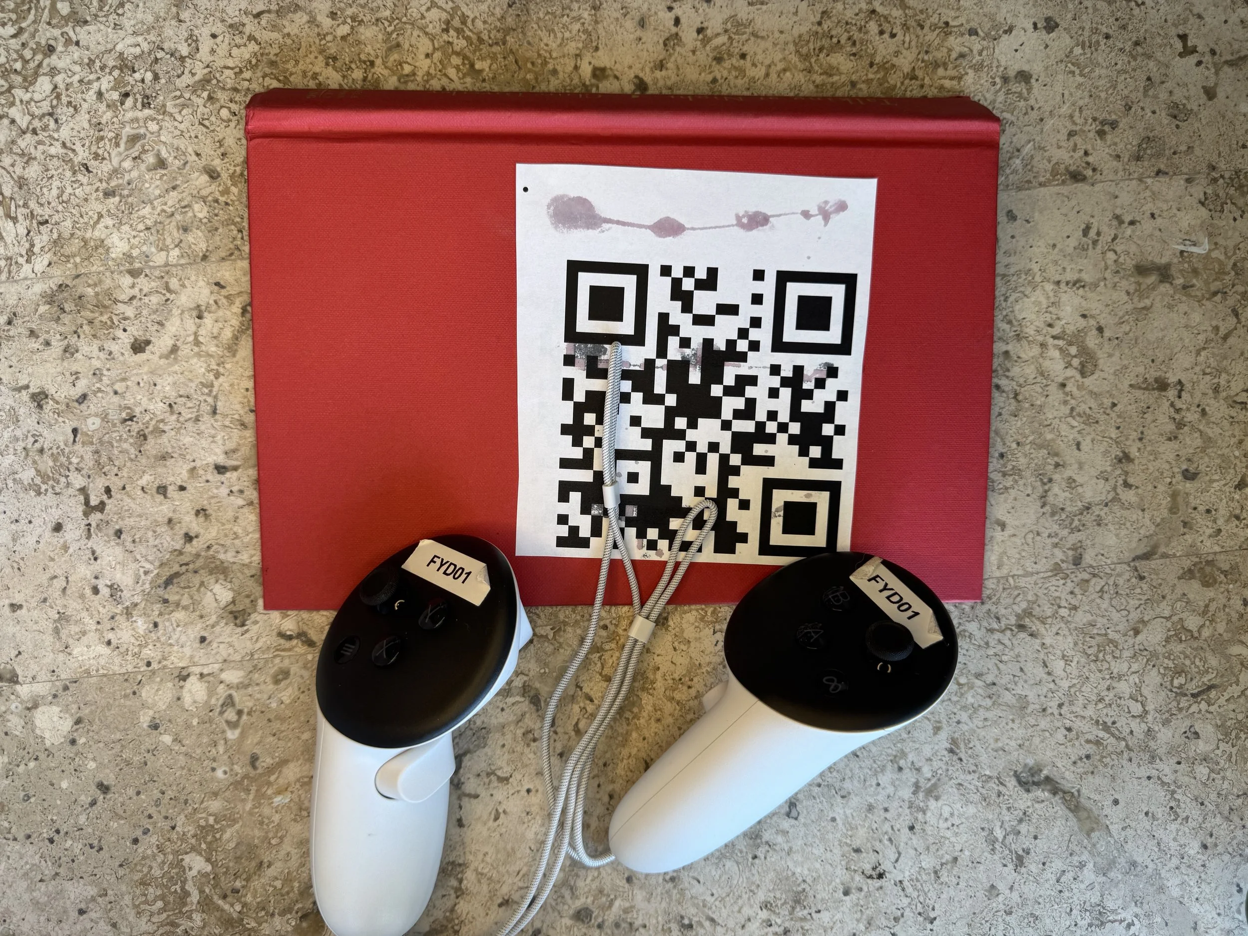
Week 10 (Mar 10 - Mar 15) | Built Prototype 3 (Binder-Like Book)
The final and most physical prototype: the binder-like VR book. This one was supposed to capture the sensory essence of opening a real-world object—bridging that emotional gap we lose when books go digital. It needed to feel substantial, deliberate, real. Instead, the binder decided it had a mind of its own. Pages sometimes spawned when opening it... sometimes didn't. Sometimes the binder opened smoothly... sometimes it slammed shut with the force of a hurricane. Implementing hand tracking, and QR detection was another nightmare. Using passtrough and hand flipping broke the original UI. I got gray hairs this week.
What Should Have Happened:
The VR Headset scanned the QR code on the binder that triggers page spawning when opened and despawning when closed.
Implement virtual tactile page flipping inside the binder.
Make sure scanning QR code on the back of the binder and reliably cleared the virtual pages.
What Actually Happened:
Headset would not automatically detect the QR code, so had to implement a “hack” so user has to do a pinch motion with left hand in order for the headset to be able to detect the book. User also has to do this for the headset to detect the closing QR
Closing the binder had a 40% failure rate, leaving virtual pages hanging awkwardly in midair.
Page flipping was half-broken, it did not look like a book, it looked more like slides, no matter what i did the page flipping animation did not want to work with hand detection.
Binder physics were unstable—sometimes the binder floated slightly after closing, making it look haunted. Furthermore no matter what i did the binder did not want to spawn where the physical book was.
Final Status
Prototype 3 was alive (barely). It had the most emotional potential, but the technical execution still needed heavy polish before real testing.
We got there. Eventually!
Week 11 (Mar 17 - Mar 23) | 1st User Testing: Mechanics
After three prototypes worth of chaos, it was time to put them in front of real users. The first round of testing focused purely on mechanical realism: did flipping a page feel good? Did haptics matter? Could people tell the difference between a real-feeling book interaction and a broken one? I was cautiously optimistic... which was, of course, a mistake.
What Should Have Happened:
Conduct tests on page-turning, binder opening, and controller book spawning.
Collect feedback on haptic strength and mechanical "feel" across prototypes.
Identify critical sensory failures.
What Actually Happened:
Haptic feedback was appreciated... when it actually triggered at the right time (which was maybe 30% of the time).
Binder prototype was praised for emotional engagement despite glitchy closing behavior.
Fully virtual book was liked for its simplicity, however user commented it was positioned really high so they had to stand on their tip toes to be able to interact with it.
Final Status
Sensory-first design was validated — users wanted the tactile feedback — but flipping mechanics and stability were priority fixes for the next sprint.

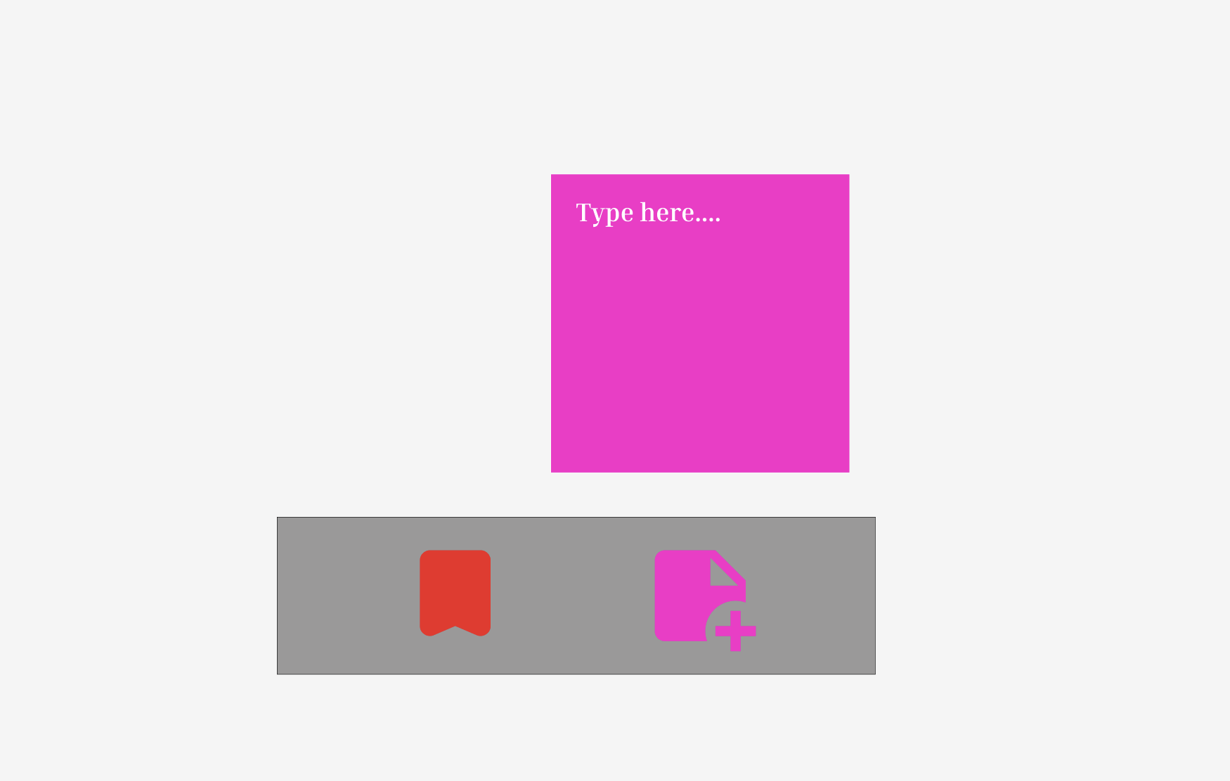
Week 12 (Mar 24 - Mar 30) | UI Design: Buttons, Annotations
With basic mechanics exposed and broken, it was time to build the support system around them. This week focused on UI design: button placement, annotation tools, and bookmarking. The idea was to keep everything distraction-free and intuitive—like adding helpful features without ruining the book immersion. Naturally, it became an exercise in accidentally hiding buttons where no one could find them, as well as fighting with physics. Fun time.
What Should Have Happened:
Design minimal, floating UI for interaction (flip, bookmark, annotate).
Make buttons easy to reach and understand without breaking immersion.
Integrate lightweight annotation and bookmarking tools.
What Actually Happened:
First iteration of buttons was basically invisible unless you crouched, squinted, and prayed.
Bookmark feature worked... but users couldn’t figure out how to exit bookmark mode, leading to weird VR panic-clicking.
Annotations opened confusing floating text panels that floated behind the book half the time.
Cleaned up UI placements manually by trial and error, promising myself I'd never manually anchor UI again (I lied to myself).
Final Status
UI technically worked. Users could now flip, bookmark, and annotate... if they could find the buttons without GPS.
Week 13 (Mar 31 - Apr 6) | 2nd User Testing Round: UI & Usability
Another week, another brutal user testing session. This time, the goal was to test pure interaction flow: could users read, flip, bookmark, and annotate naturally without breaking immersion? Spoiler: the answer was “sort of, maybe, please fix this immediately.”
What Should Have Happened:
Test the readability and usability of the new UI.
Collect feedback on button placement and interaction flow.
Identify confusion points and navigation errors.
What Actually Happened:
Most users loved the bookmarking tool but still struggled to find the tiny close button ("Where is it? Oh, THERE? Seriously?")
Annotations were hit-or-miss — users liked writing notes but hated the clunky panel positioning.
Fully virtual book scored points for easiest interface navigation, but was still "too sterile" compared to the binder.
Controller-spawned book was called "fun" but "awkward" if the spawn point drifted.
Final Status
UI made a lot of progress. Usability was good enough to survive final testing, but spatial design still needed better polish.

Week 14 (Apr 7 - Apr 13) | Refining Everything Before the Final Test
This week was pure polish. Fixing lingering flipping bugs. Rebalancing haptic strength. Adjusting spawn positions. Basically, trying to make the prototypes seem like they were finished and intentional, not slapped together by a sleep-deprived Unity goblin (me).
What Should Have Happened:
Finalize all three prototypes for preference testing.
Fix flipping directions across all prototypes.
Clean up UI and page spawn behavior.
Tune haptic feedback and animation smoothing.
What Actually Happened:
Flipping was FINALLY corrected on the fully virtual book — after literally reversing every single page prefab’s orientation manually.
Binder closing behavior was fixed using a lazy brute-force despawn trigger (no shame at this point).
Controller-spawned book stability improved, but sometimes still twitched slightly on appearance like a horror movie jump scare.
UI adjusted again after finding out users loved the bookmark button... but still hated the annotation panel floating randomly.
Final Status
Prototypes were ready. Not perfect, but presentable. Everything looked stable enough for the final user showdown.
Week 15 (Apr 14 - Apr 20) | 3d User Testing Round: Preference
Another week, another brutal user testing session. This time, the goal was to test overall user preference across all three prototypes — physical-hybrid, fully virtual, and controller-spawned. Spoiler: Prototype 1 dominated, Prototype 3 intrigued, and Prototype 2... well, it existed.
What Should Have Happened:
Compare all three prototypes in terms of immersion, usability, and interaction flow.
Identify the most preferred reading method.
Gather feedback on tactile satisfaction and environment.
Validate the final direction for redesign.
What Actually Happened:
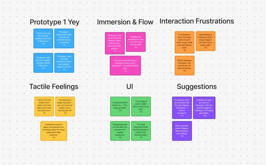
Prototype 1 was the clear favorite — users felt like they were "in Ready Player One" and forgot it was even VR.
Users appreciated the simplicity and presence of Prototype 1, especially when placed on a cozy table in a pretty room.
Prototype 3 got points for creativity — users were intrigued by its potential and wanted to see it developed further.
Prototype 2 was consistently called out for awkward hand positioning, mechanical page flipping, and lack of immersion.
Page flipping across Prototypes 1 and 2 was still clunky — stuck pages and incorrect turns were common.
Physical-vs-virtual inconsistencies frustrated users, especially when the weight or feel didn’t match expectations.
UI elements weren’t heavily criticized, but annotation tools and interactions still felt rough and unpolished.
Final Status
Prototype 1 is the preferred direction moving forward, praised for immersion and intuitive design. Prototype 3 offers a strong foundation for innovation with a bit more polish. Prototype 2 will likely be phased out. Page flipping remains a stubborn issue and needs serious rework before the final iteration.
Final Status
User 3 Files
User 4 Files
User 5 Files
Week 16 (Apr 21 - Apr 26) | Microsite, Final Video, and Existential Dread
The final stretch. Build the capstone microsite. Film the documentation video. Edit everything without screaming. Submit. Hope. Pray.
What Should Have Happened:
Finish the full microsite showcasing the three prototypes and research journey.
Record a polished demo video walking through the project goals and findings.
Finalize all documentation and submission assets.
What Actually Happened:
Microsite fought me on literally everything: layout margins, header spacing, responsive resizing. I wrestled Wix into submission one painful pixel at a time.
Filming the demo video was a trainwreck: recording glitches, headset battery deaths, and Unity deciding to freeze mid-shot.
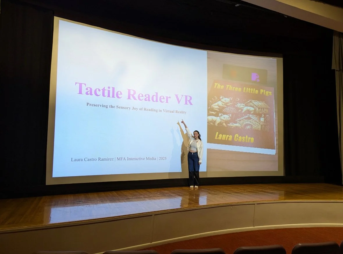
Finally pulled together a full video narrative matching the emotional tone of Tactile Reader VR—preserving the joy and tactile magic of reading.
Barely survived editing without throwing my laptop across the room.
Final Status
Microsite complete. Final video complete.
Somehow, against all odds, Tactile Reader VR lives.

Week 16 (Apr 26 - May 2) | Final Presentations & Showcase
Another week, another full-body adrenaline spike. This time, the goal was to survive the final presentation in front of the School of Communication faculty and make it through the Interactive Media Showcase without collapsing from overstimulation. Spoiler: we made it. We’re done.
What Should Have Happened:
Present Tactile Reader VR to the School of Communication.
Defend the work during Q&A with faculty and advisors.
Showcase both Tactile Reader and the VR Mosque project at the Interactive Media Expo.
Wrap up all project tasks and deliverables.
What Actually Happened:
The presentation was a mix of excitement and sheer terror — professors asked razor-sharp questions post-pitch that made it feel like they hated the project (they didn’t, right?).
Answering questions felt like verbal gymnastics — tough, fast, and a little brutal, but ultimately kind of thrilling.
The showcase was a whirlwind — sprinting between two projects (Tactile Reader + VR Mosque) meant lots of talking, smiling, and zero time to breathe.
It was amazing seeing everyone’s work on display — the cohort really showed up.
Tactile Reader didn’t win the XR category, which stung a little, but seeing it all come together was still incredibly satisfying.
Everything is officially done. No more bug fixing. No more tweaking. No more journals (except this one). Just… done.
Final Status
Tactile Reader VR is complete. Presented, showcased, and signed off. It may not have taken home a trophy, but it absolutely earned its place.